PASTAMORO
Design the packaging for three distinct pasta varieties: fettuccine, gemelli, and ancini di pepi.
OBJECTIVES
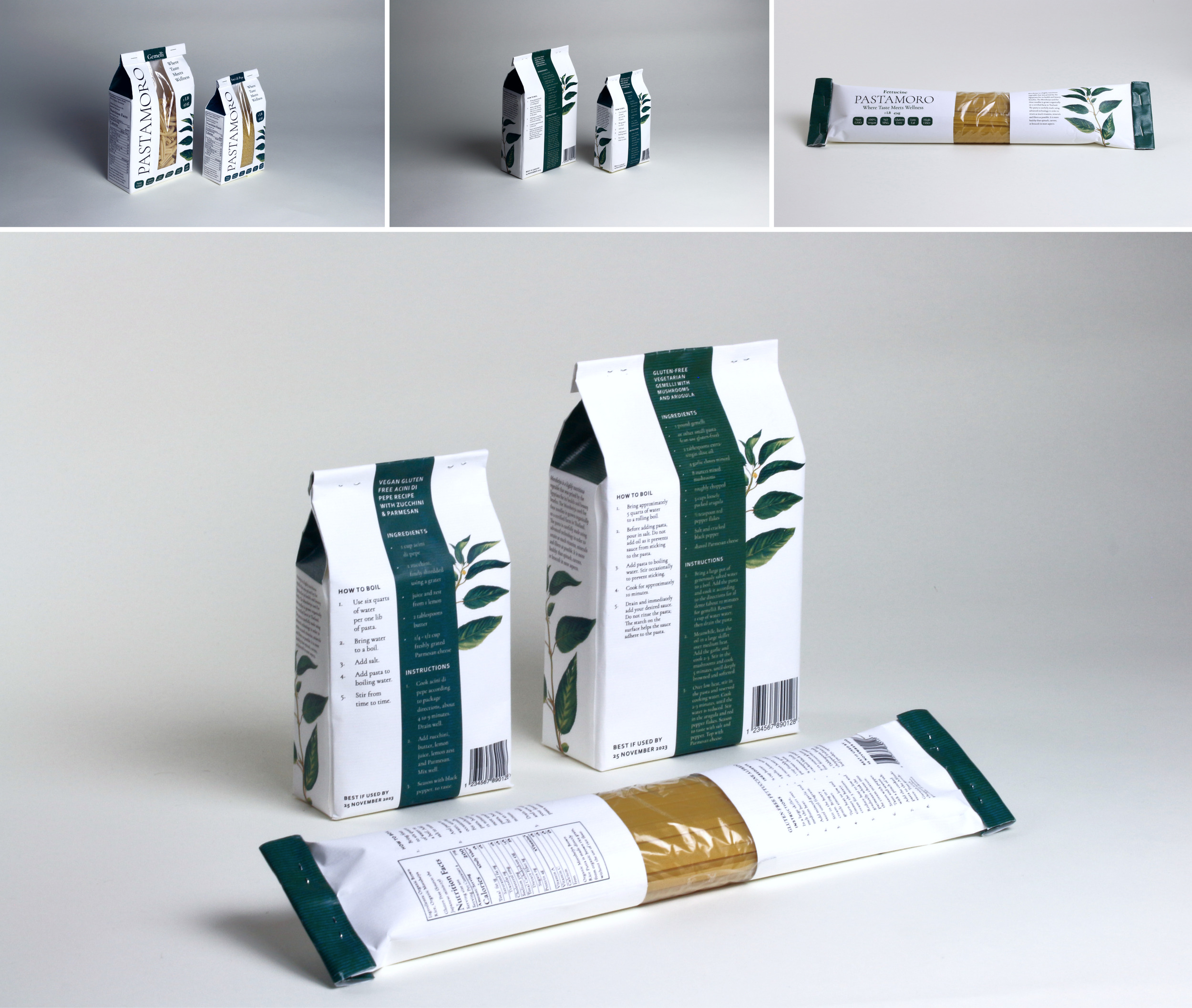
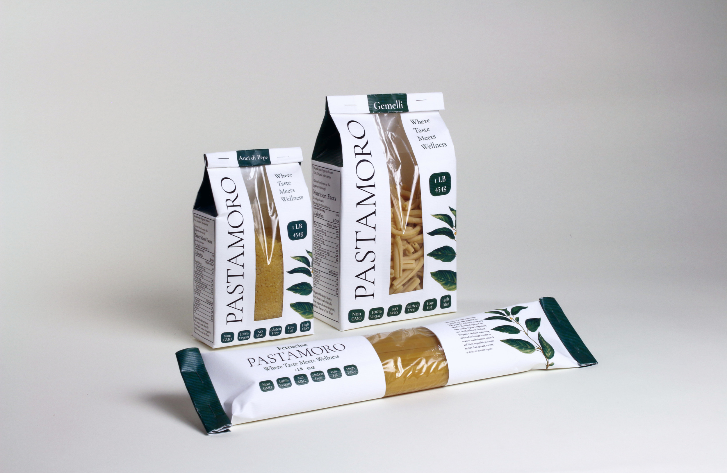
The project revolves around designing the packaging for three pasta varieties: Fettuccine, Gemelli, and Ancini Di Pepi. Everything from the pasta ingredients to the brand design, strategy, mission, and values is created by me.
DELIVERABLES
Brand System
Dimensional Prototype
My Goals for the Brand
I interviewed Randall, a swimmer, biker and pasta critic and here are some exchanges that helped me with concept generation on my pasta brand.
My goal was to create a brand revolving around minimally processed organic pasta products that meet rigorous taste, texture, fiber and nutritional standards using eco-friendly and sustainable practices, from ingredient sourcing to packaging.
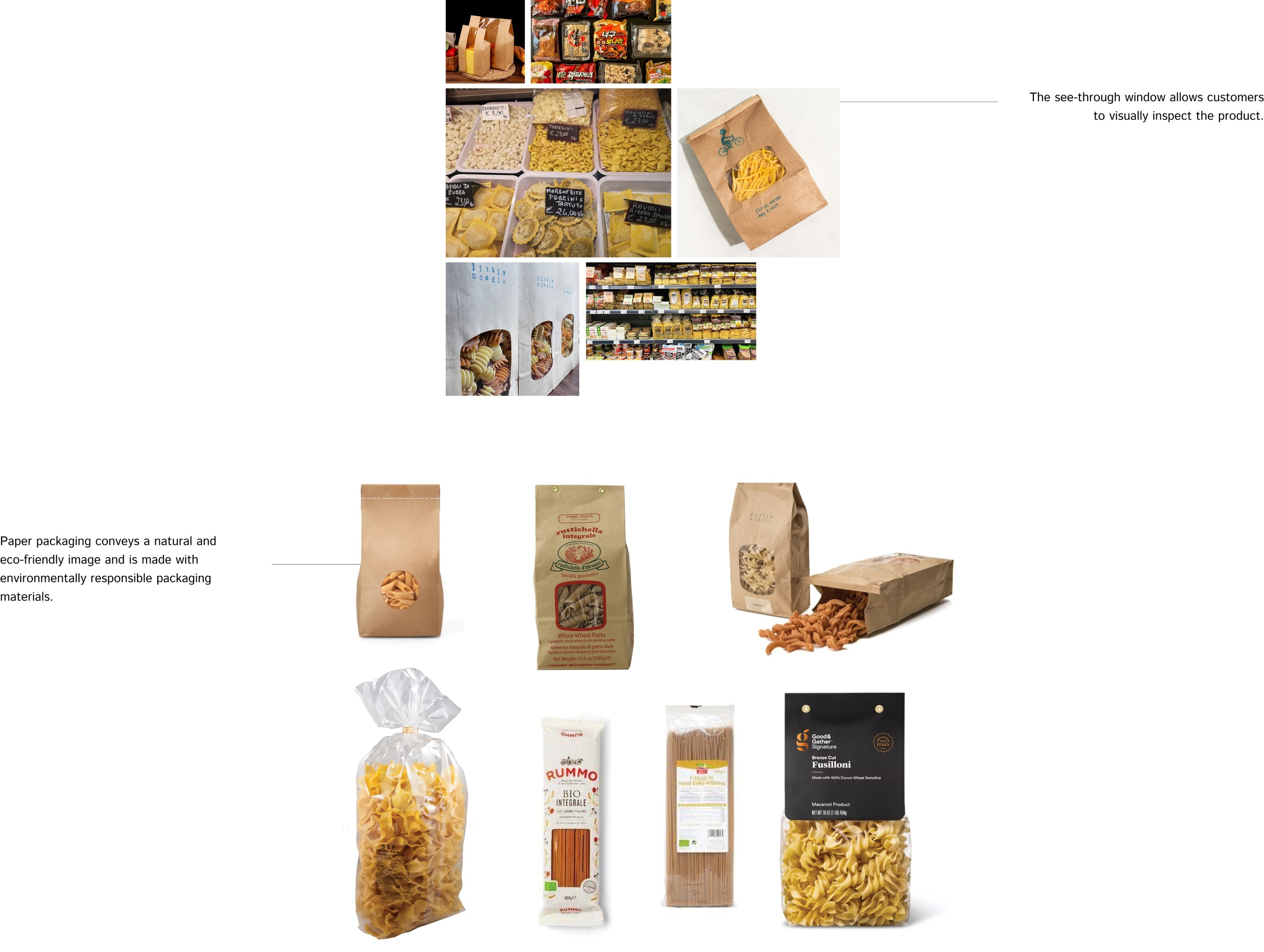
In-store Photography On Pasta Packaging
Keeping these goals in mind, I visited a store and took some photos of pasta.
healthy nutrition facts
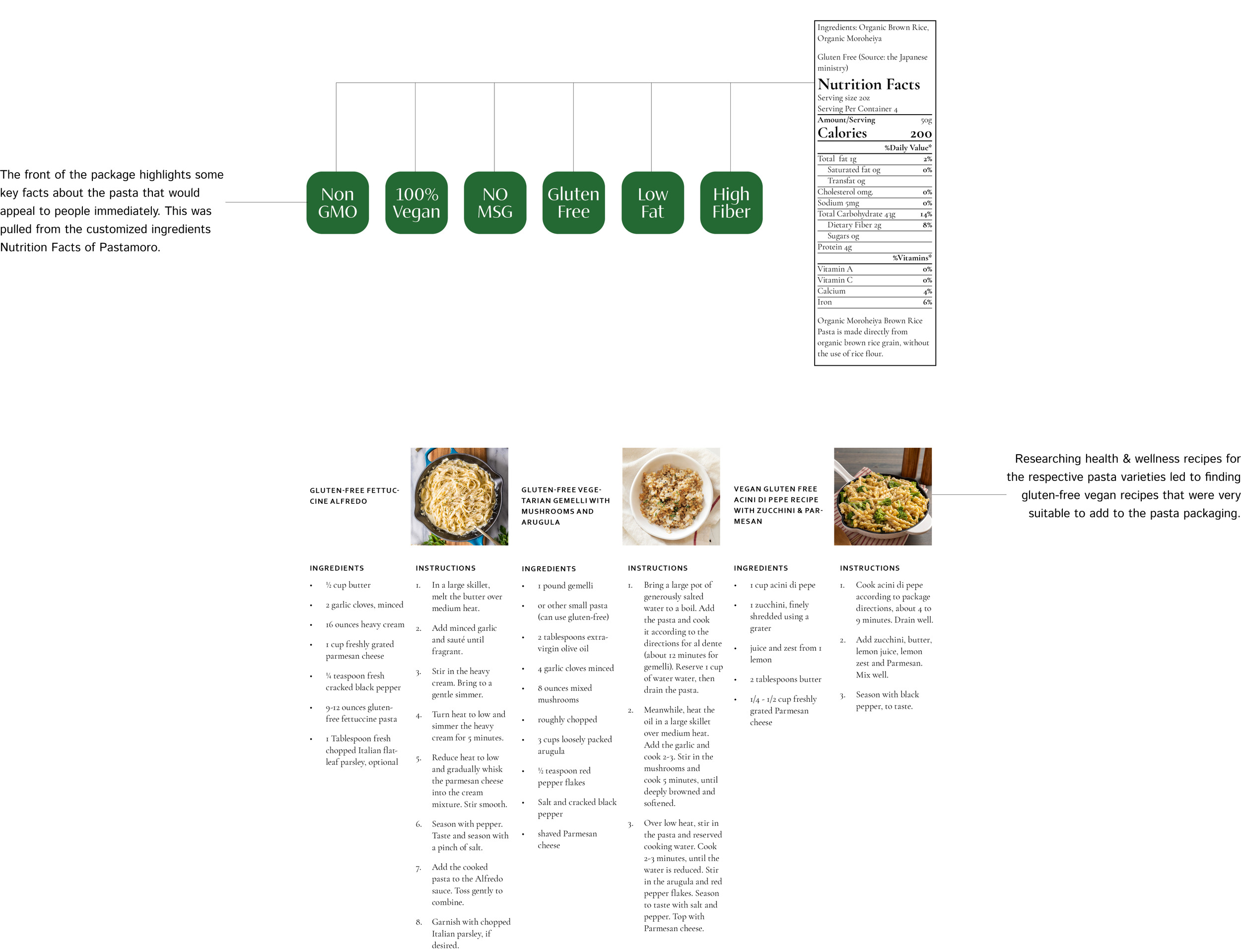
I narrowed my search by looking at the ingredients and nutritional value of healthy pasta brands.

Moroheiya Powder
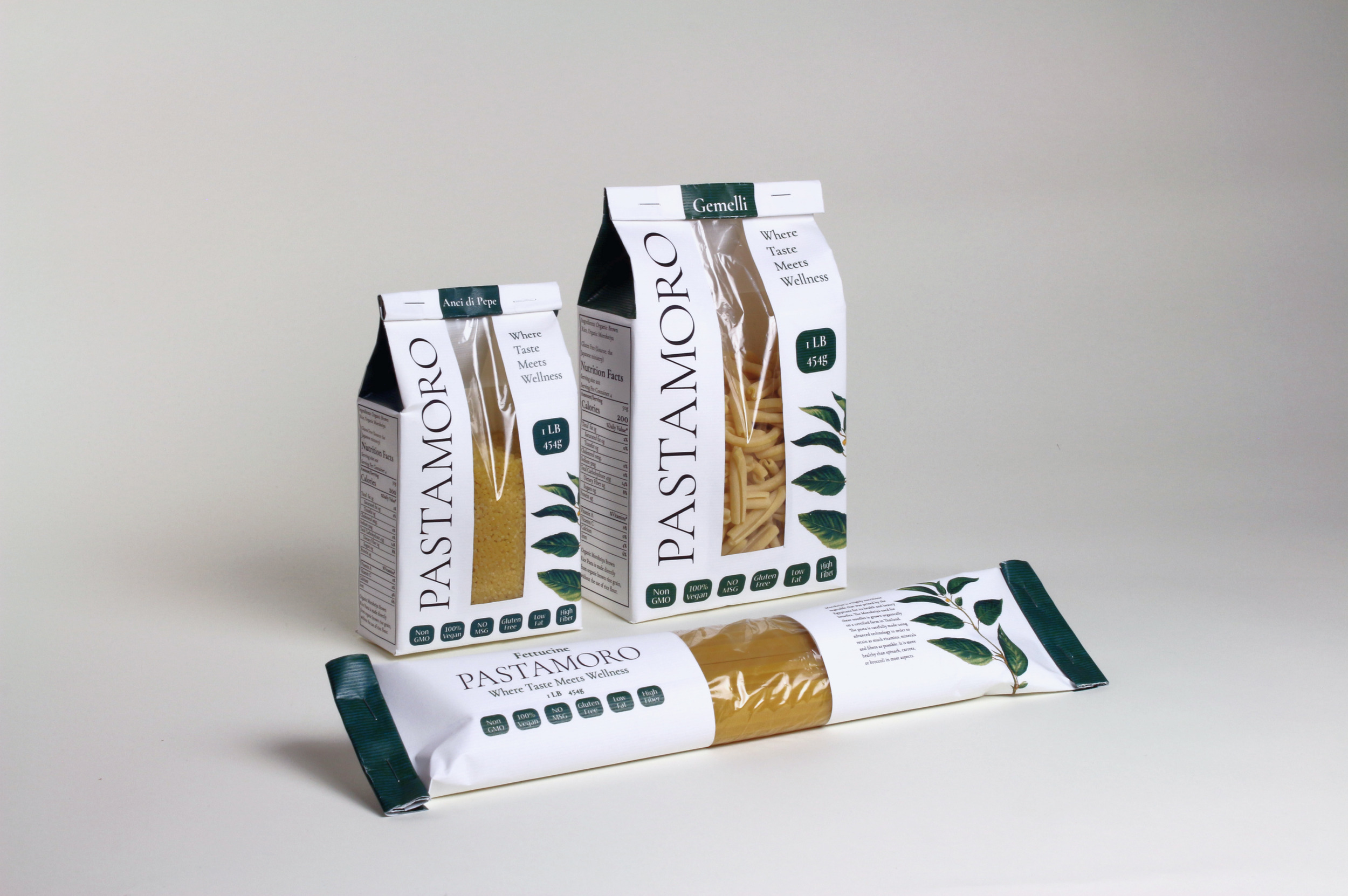
I was able to pinpoint a key ingredient of health and wellness in my pasta. By incorporating organic Moroheiya powder into the brand as well as the pasta I could elevate the nutritional value while creating a marketable aspect for my pasta. The name PASTAMORO itself is an example of this incorporation.
What is Moroheiya? Moroheiya is a nutritious vegetable that was prized by the Egyptians for its health benefits. The Moroheiya used for these noodles is grown organically on a certified farm in Thailand. The pasta is carefully made using advanced technology to retain as many vitamins, minerals, and fibers as possible.
Who is my competititon?
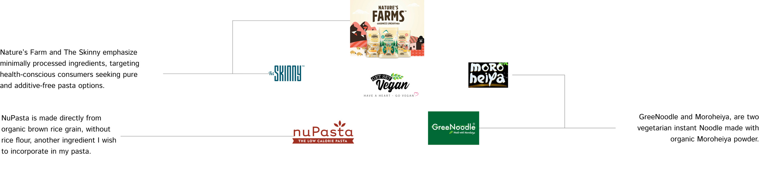
How will my product stand out?

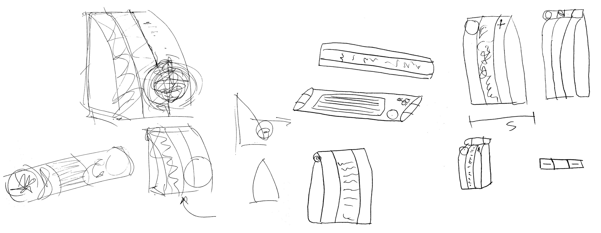
concepting packaging sketches
I started with rough drawings of paper packaging with see-through windows and large typography.
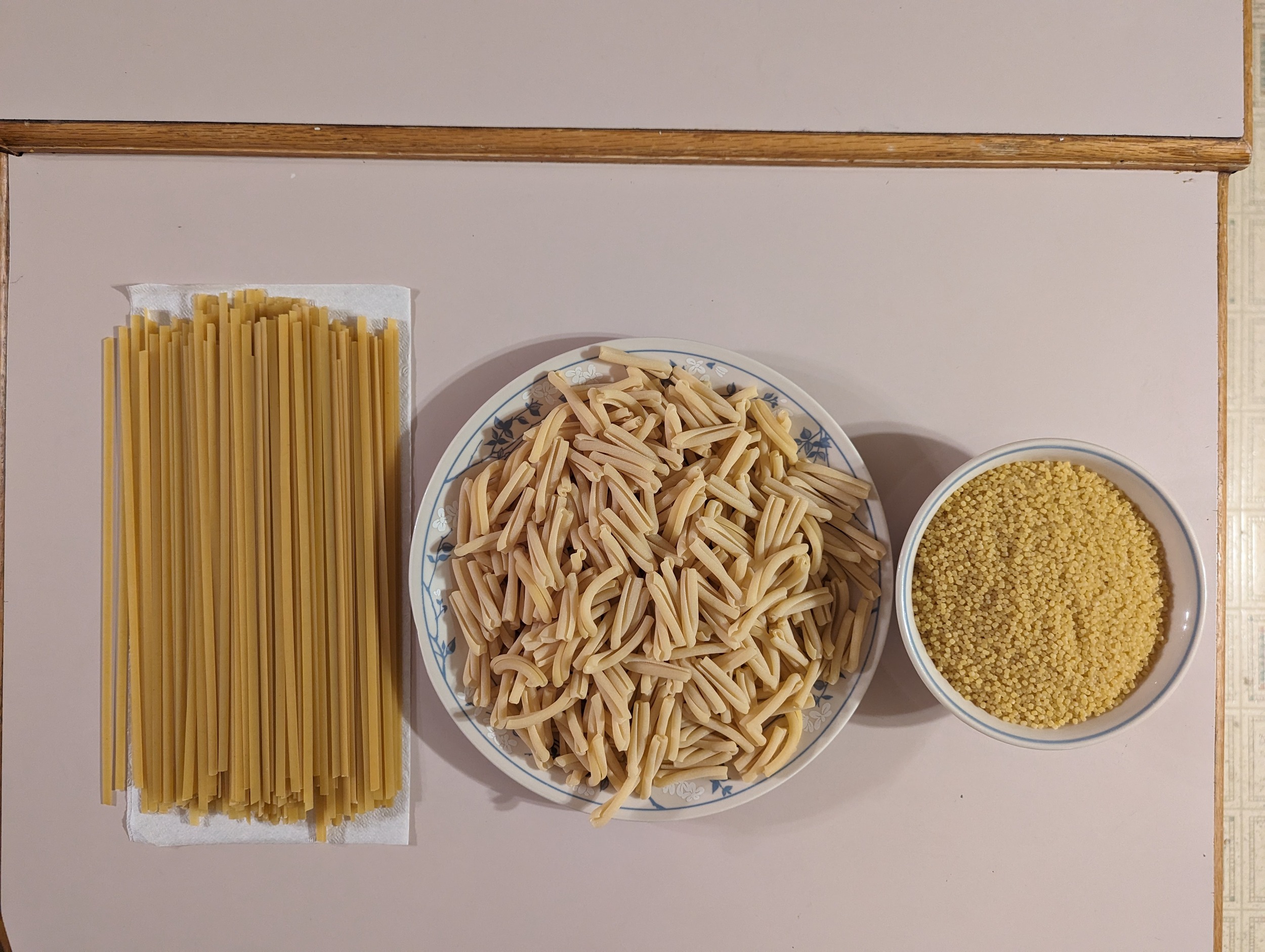
gathering materials
I went out and bought three types of pasta so I could use it to make the packaging. I collected materials to start crafting a rough creation of my organic bag.

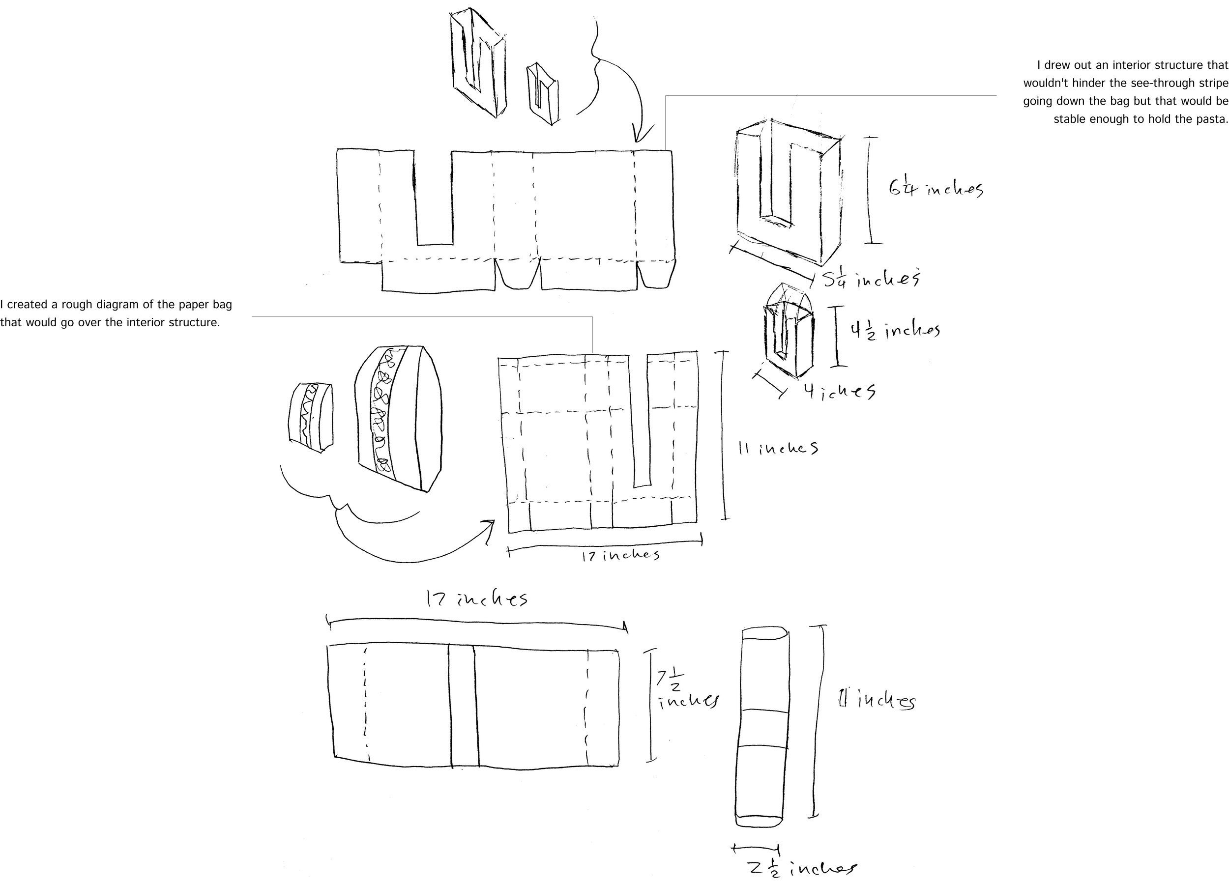
crafting interior structure
My first prototype was bulky with the pasta inside it, so I decided the package needed some kind of interior structure. I drew out diagrams and worked on the interior structure.
What information will capture the attention of my target audience?
What other information needs to be on pasta packages?
Colors & Illustrations & Fonts
What kind of packaging materials fits my brand message?
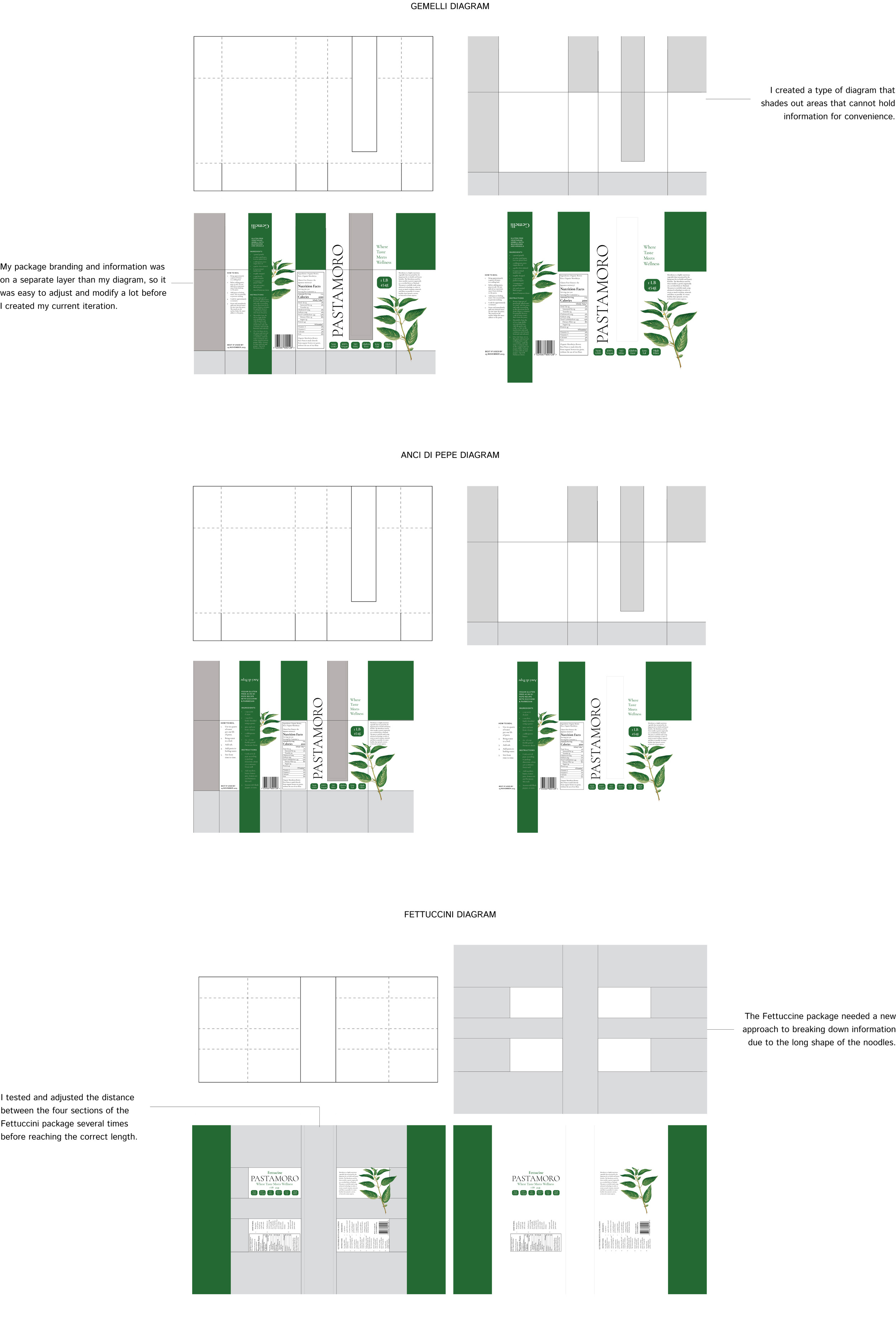
Where does the information go on each package?
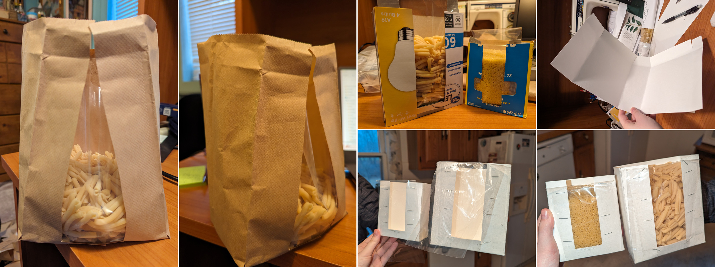
I used my rough prototypes to break down information, hierarchy, and architecture. Deconstructing the bags helped to create better digital diagrams for each pasta.
some adjustments
The process of creating 3D prototypes from 2D diagrams presented a few issues such as having to adjust the green part of the package to fit over my interior structures.
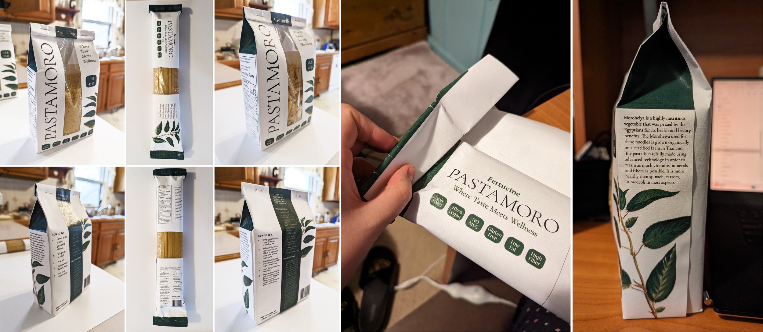
current packages
It was important to make sure that there was a consistent feel when all the packages were sitting next to each other.