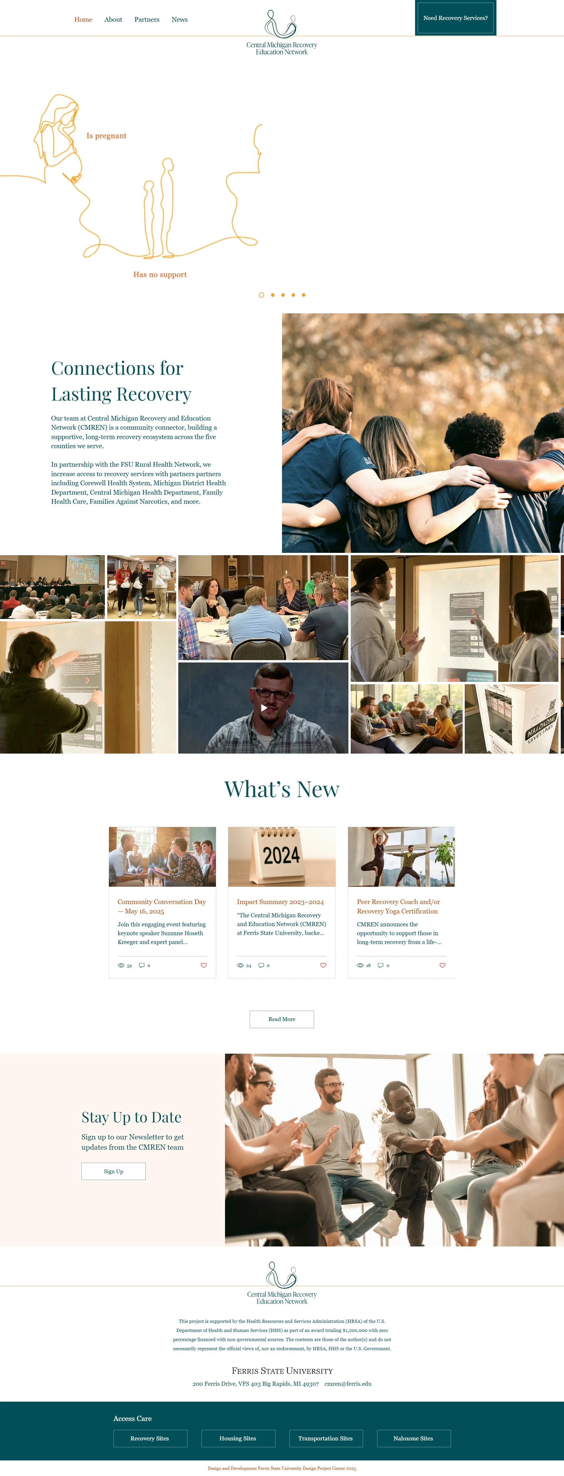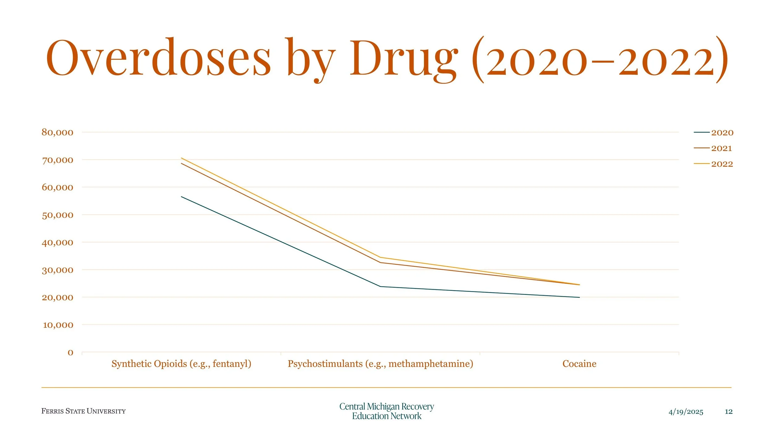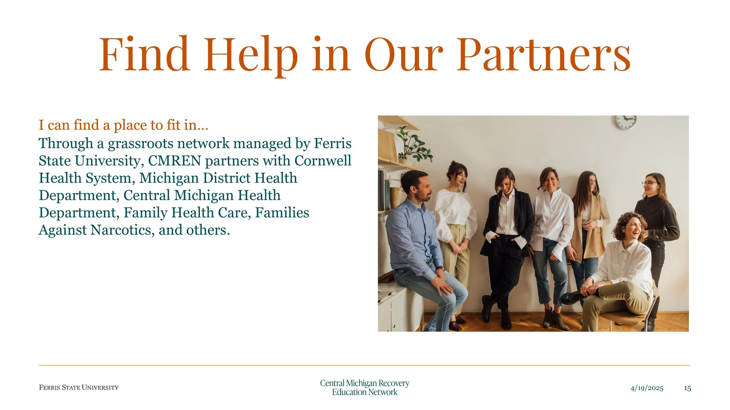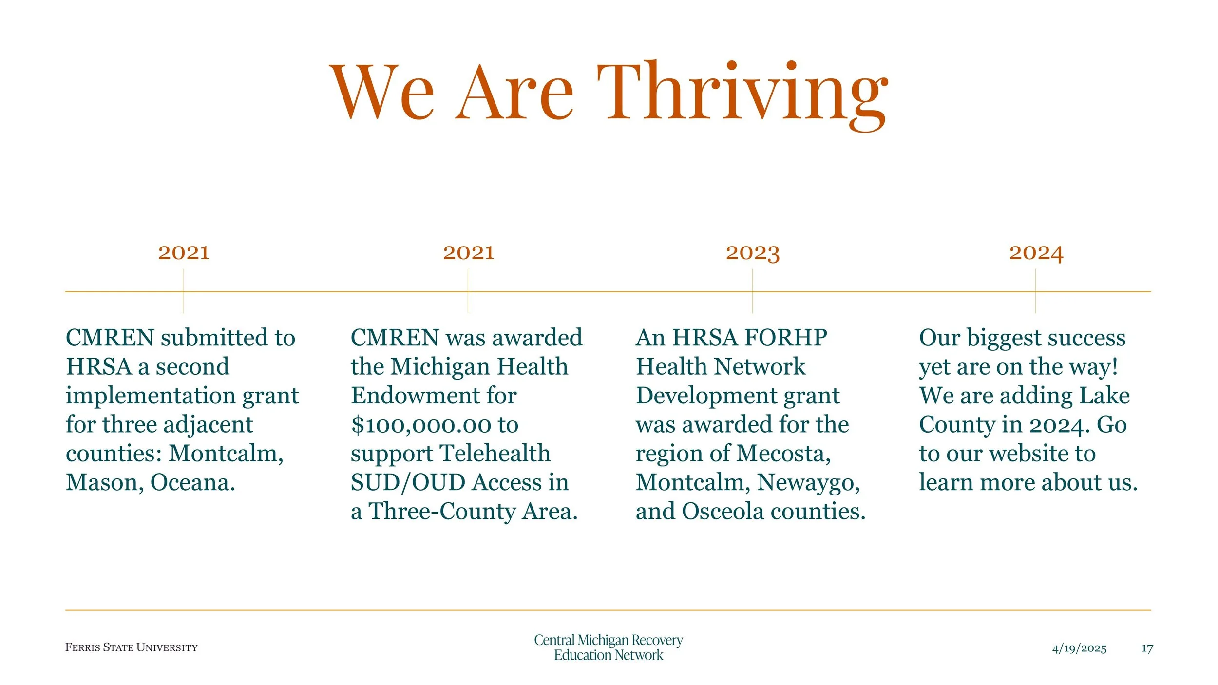
Redesigned the brand and website of The Central Michigan Recovery and Education Network.
A UX case study on helping CMREN better serve its diverse community.
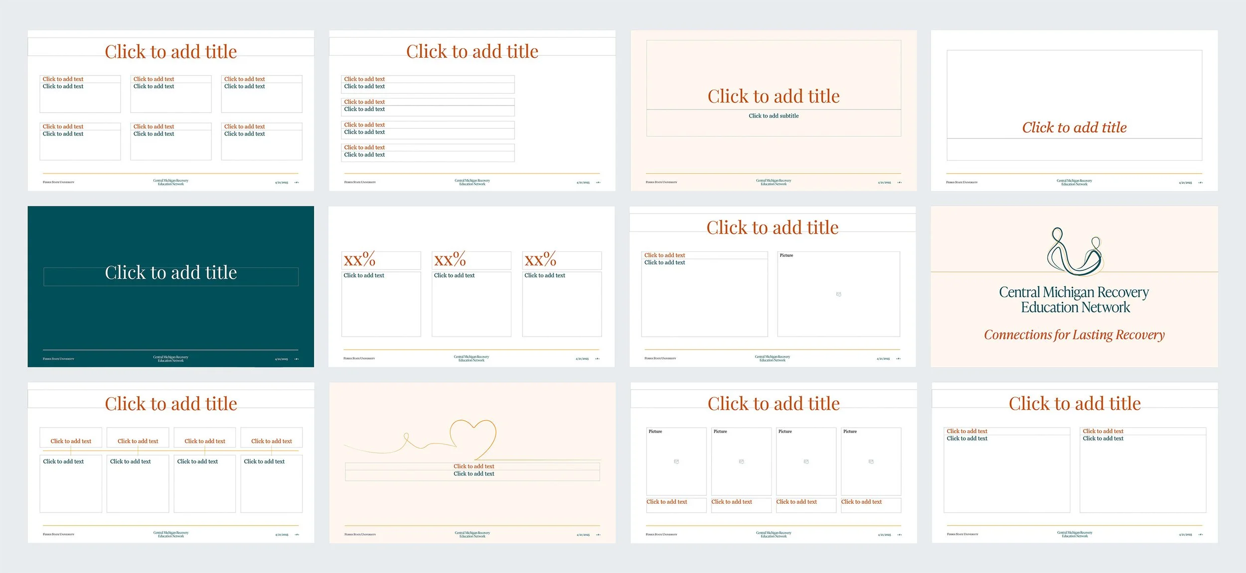
CMREN is a nonprofit connecting recovery services across five Michigan counties. I helped re-design a clean, user-centered Wix website with simplified navigation for both partners and individuals seeking help. Key contributions included a modular partner directory, filterable resource map, branded news system, and PowerPoint templates. The final product delivered a cohesive brand experience and a flexible design system that the client could easily maintain.
Client: Central Michigan Recovery & Education Network
Timeline: Aug 2024 – May 2025
Tools: Wix, Figma
Who is CMREN?
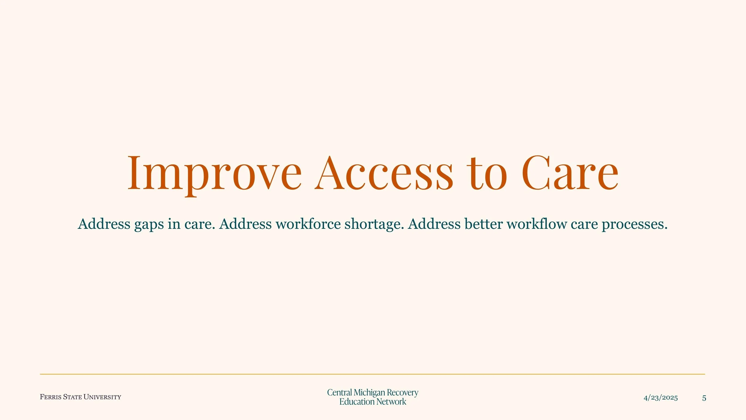
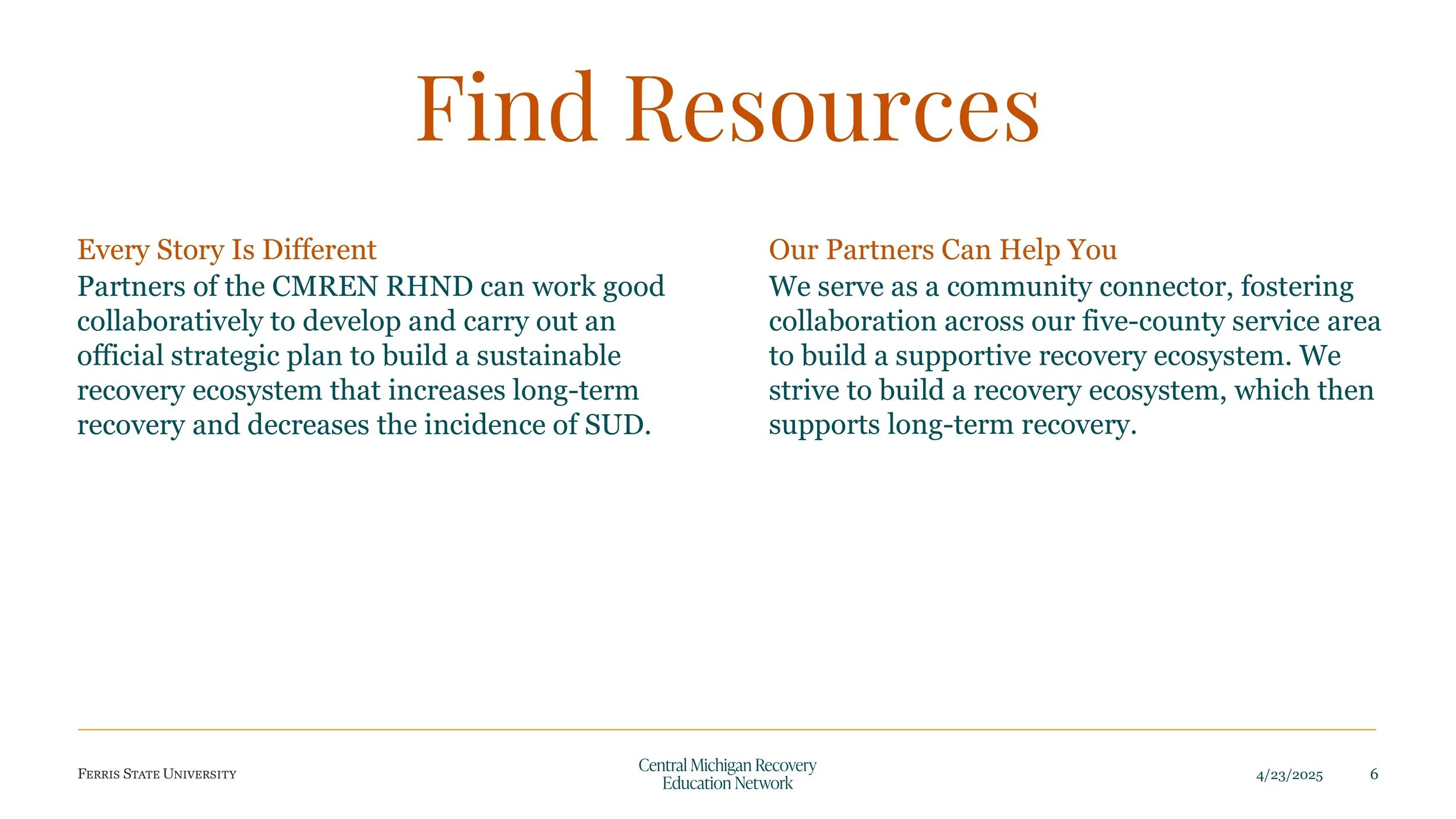
We created a new visual identity inspired by “threads” to represent connection and support, applying it across digital and print materials.

User needs?
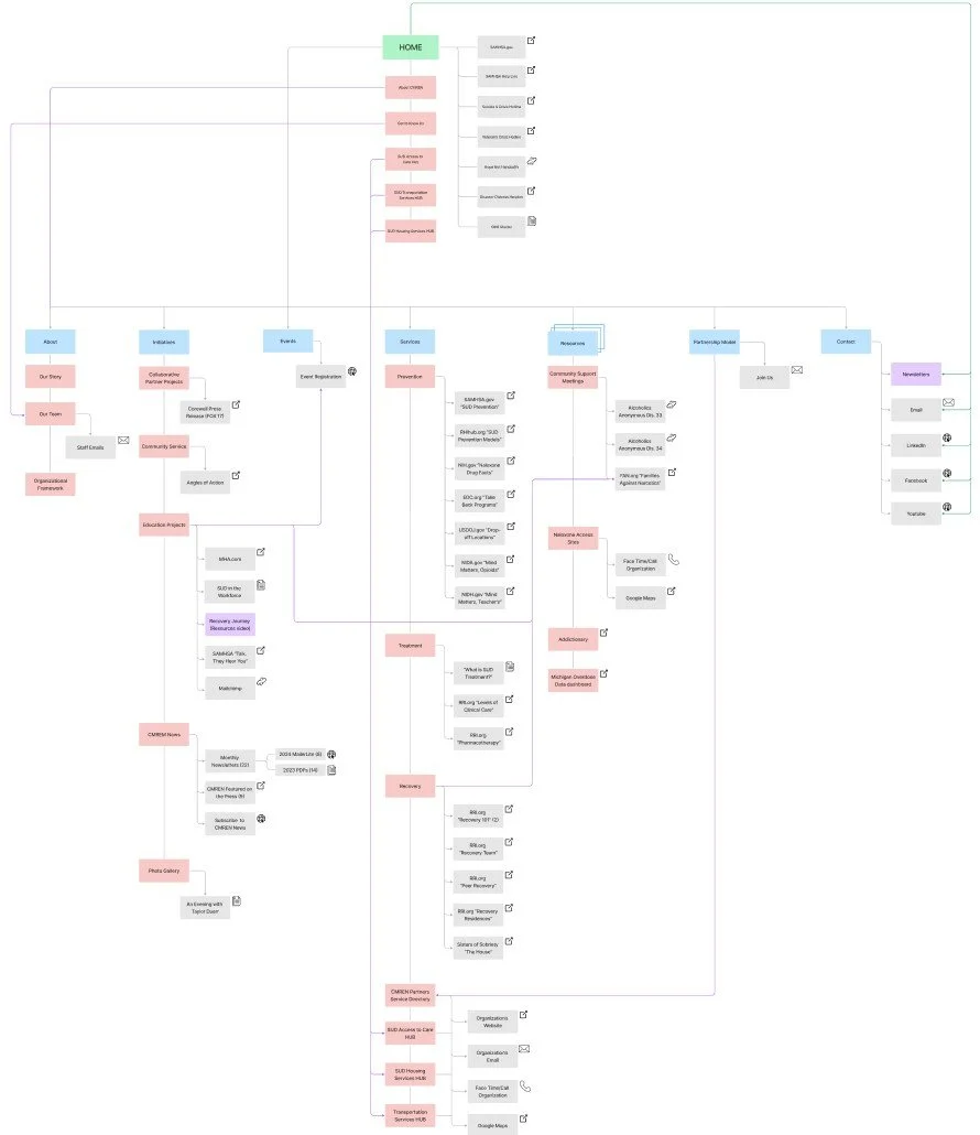
We mapped partner and individual connections to CMREN, then used those insights to rethink the information architecture of the site.
Navigation Revamp
Before:
Information was spread across multiple overlapping menu options, making navigation confusing and cumbersome. Many users mistakenly believed the site was a recovery service itself, rather than a network connecting recovery services.
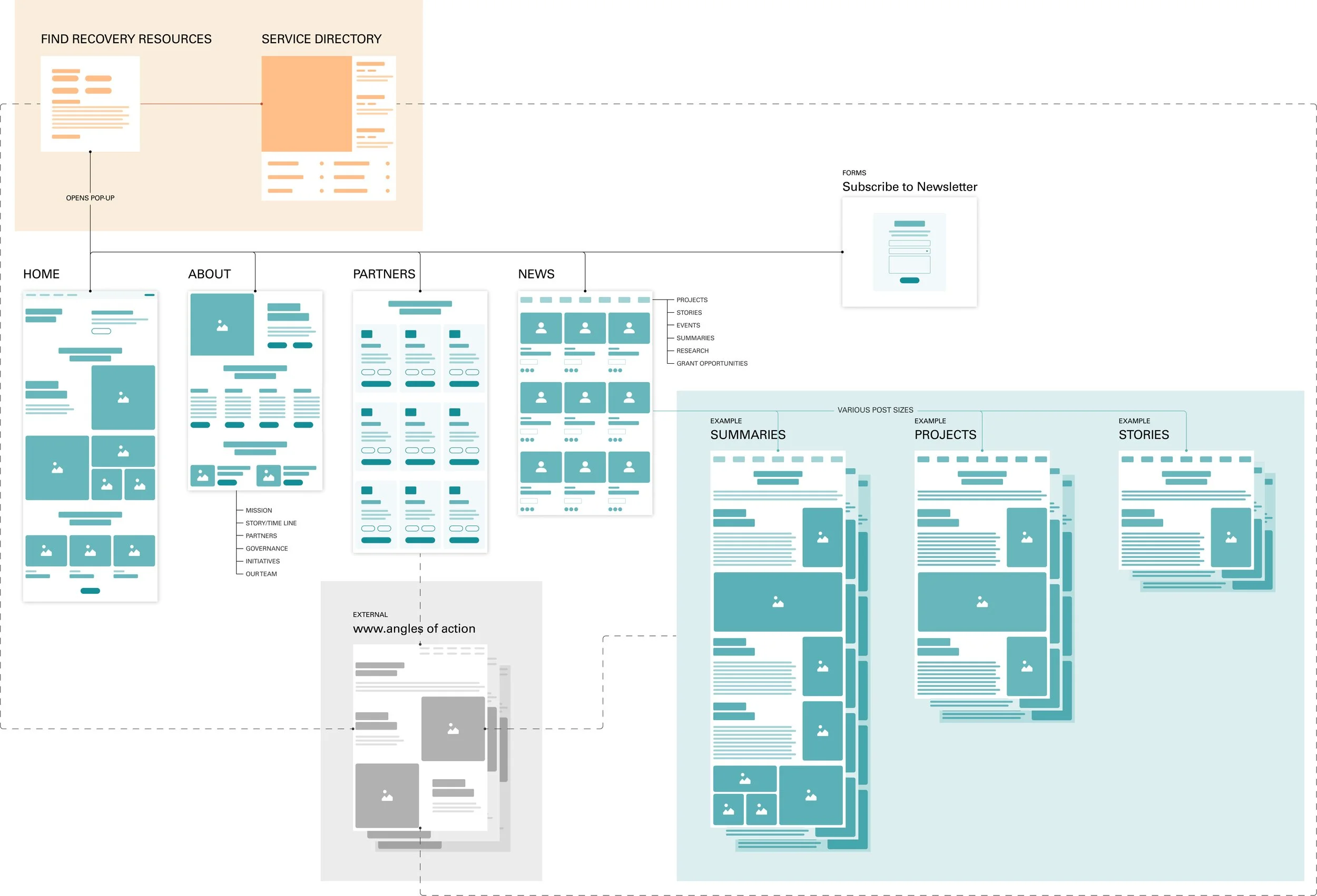
After:
The navigation was streamlined to just Home, Partners, News, and a popup targeting the secondary audience—SUD individuals (Substance Use Disorder individuals). This redesign made the site clearer, more intuitive, and emphasized its role as a network connecting services.
Before Vs After
Recovery Resources Pop-Up Redesign
Before:
Information for those seeking immediate help was scattered across multiple pages, making it difficult for them to locate relevant services. There was no clear entry point for those seeking immediate help.
After:
Recovery resources are now centralized in a single, accessible pop-up. Users can filter services by county, making it faster and easier for the right audience to find the help they need.

News Section Improvements
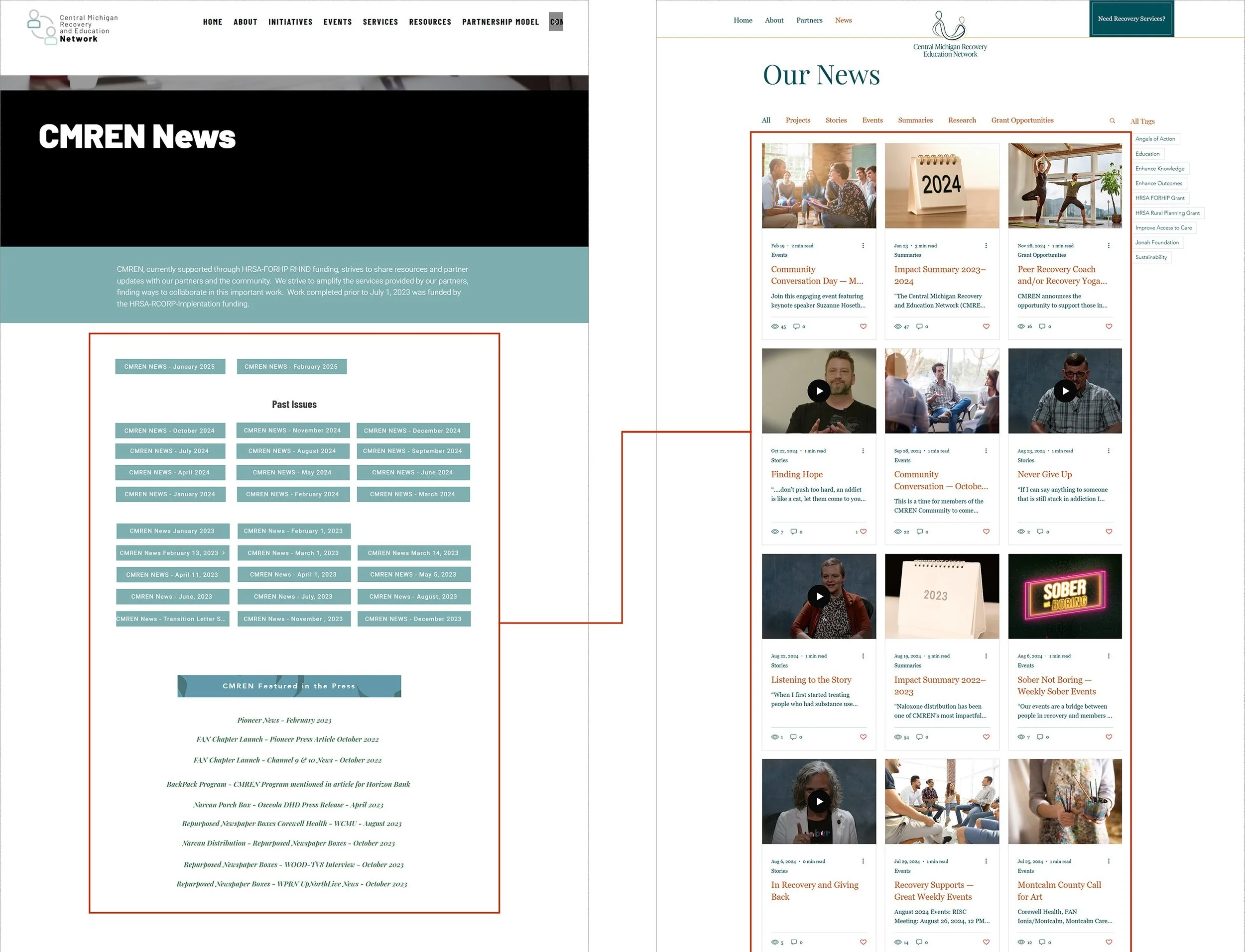
Before:
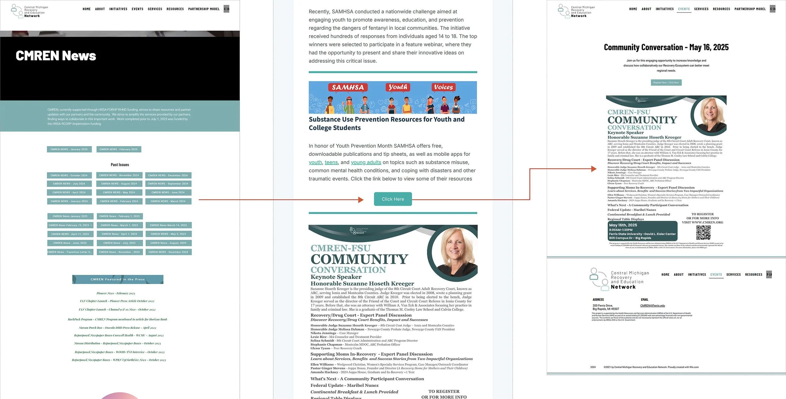
The News Section consisted of buttons to monthly newsletters, which sent users in a confusing loop—from the website to the newsletter and back again—without providing a clear place to access content.
After:
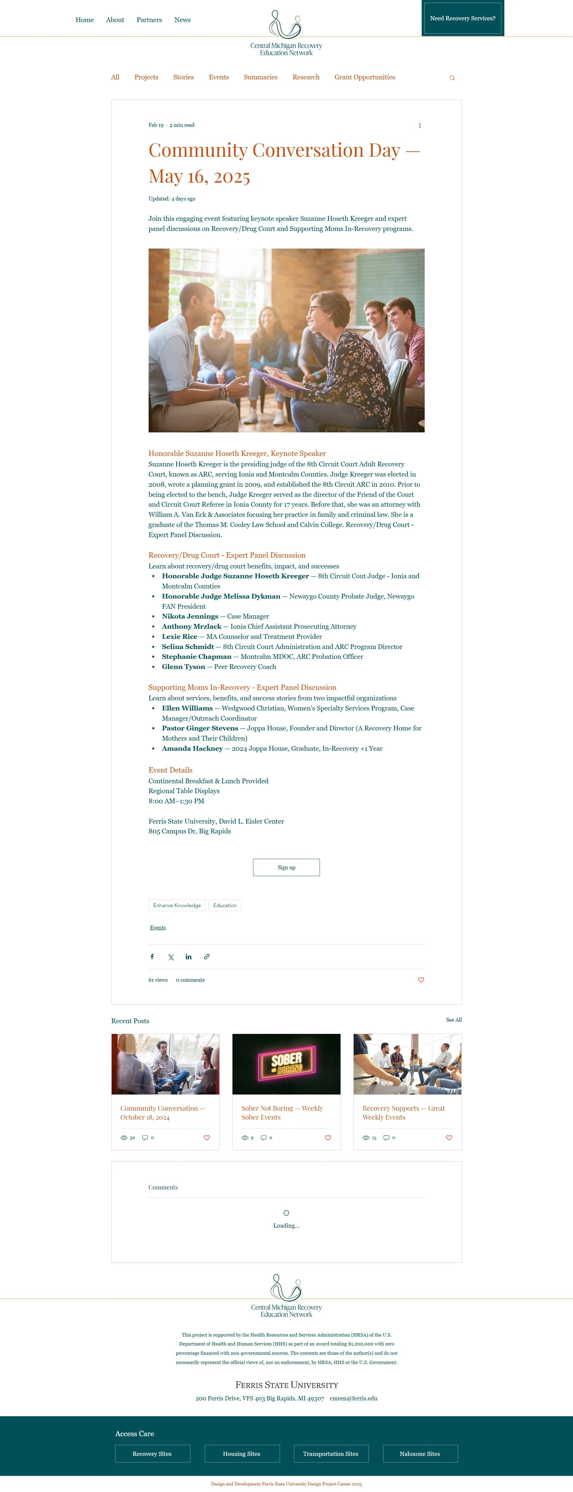
We restructured the News section by adding all relevant information into articles that could be found using filters and tags, and ELIMINATED the buttons that previously linked to monthly newsletters.
Old CMREN Flow
News Section: Old Vs New
New CMREN Flow

